Case Study
Doubled Activation Rates by Reducing Friction in Signup and Purchase Flows
The Moment
"Oh, wow — that's terrible."
The platform was spending on new features while losing customers at the top of the funnel. Activation had stalled at 4.5% — and no one had traced the root cause to the purchase experience yet.
"Oh, wow — that's terrible."
— A senior leader, quarterly strategy meeting
When I joined Pragmatic Works, my initial audits revealed a purchase experience that was actively driving churn. Prospective customers were spending up to 40 minutes trying to complete a purchase — a conversion killer. That reaction from the company president — watching session recordings for the first time — was the inflection point that shifted months of stakeholder skepticism into a prioritized initiative.
The Audit
What the Data Revealed
The user journey for new customers was riddled with obstacles: navigation bugs disrupting freemium sign-ups, pricing and cart pages with poor mobile usability, and a lack of trust signals throughout. I triangulated HotJar session recordings and surveys — behavioral data showing where users stalled, paired with what they said about it in the moment — alongside diary studies from internal staff who spoke with customers daily.
Making It Visible
How I Moved the Room
Stakeholders initially prioritized feature rollout over usability fixes. The turning point came when I brought session recordings into a quarterly strategy meeting — watching real users struggle for over 30 minutes just to create an account reframed the conversation from "nice to have" to "critical path."
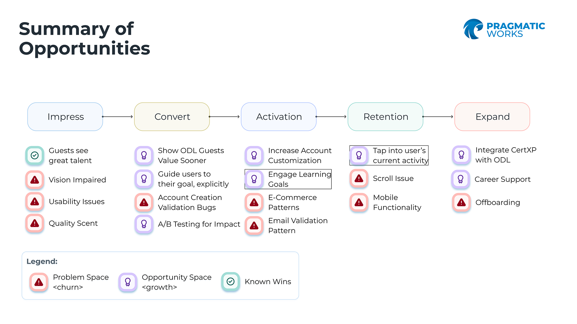
I then built an Opportunity Solution Tree to connect validated pain points to prioritized product bets — replacing guesswork with evidence and giving the team a shared framework for evaluating future trade-offs.
The Work
Three Surfaces, One Broken Journey
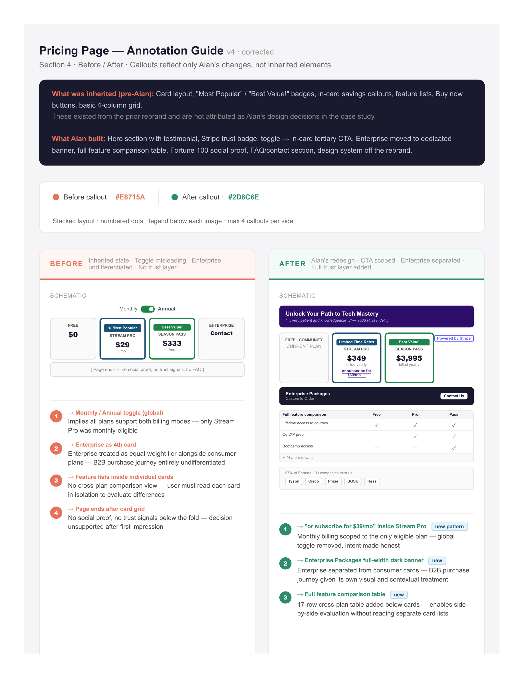
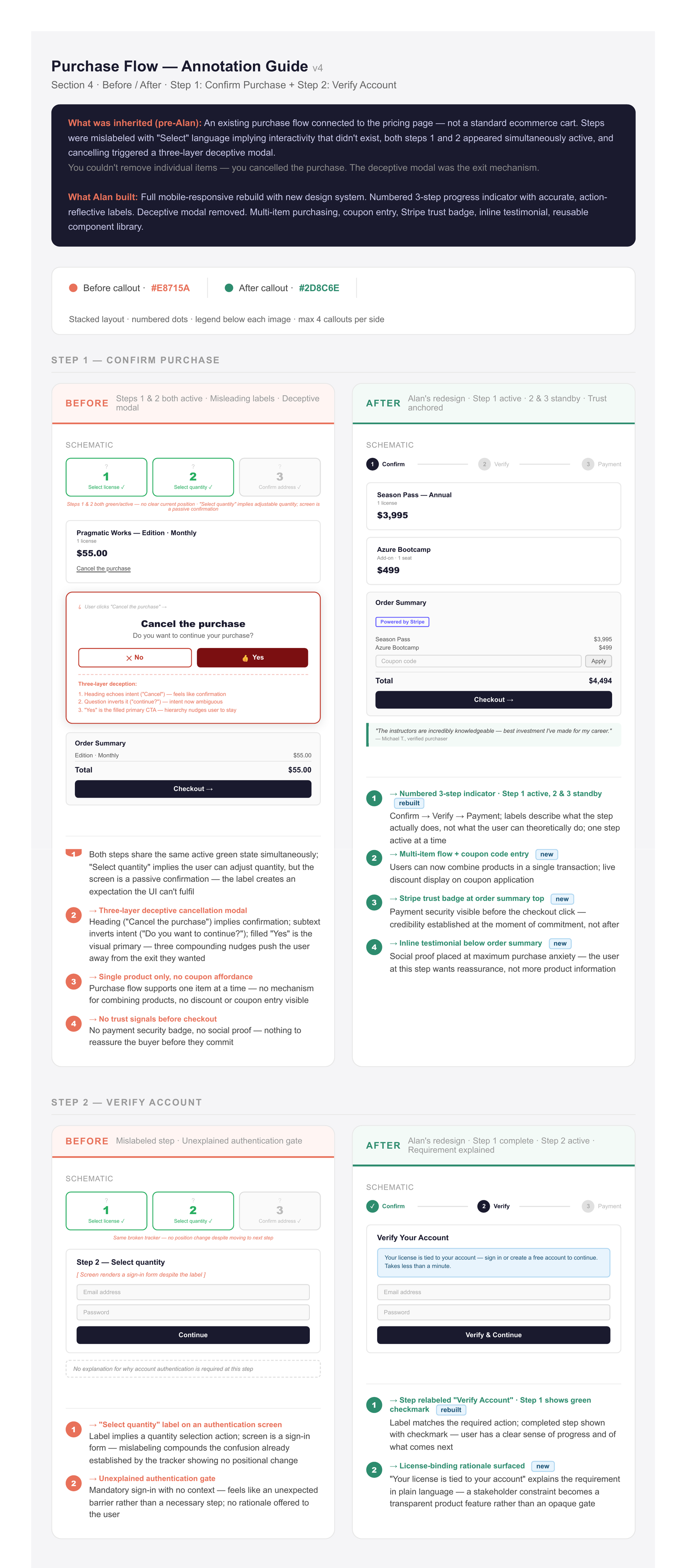
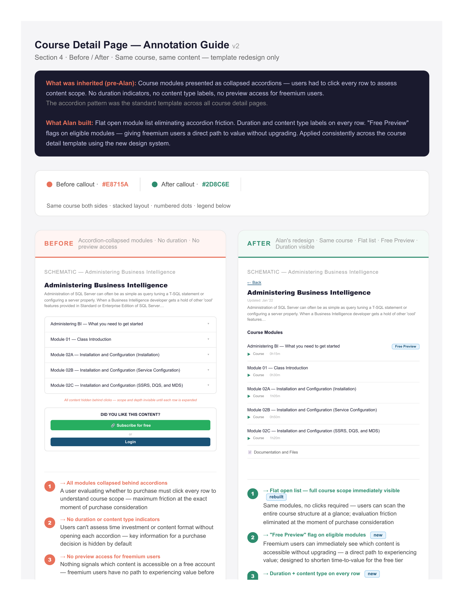
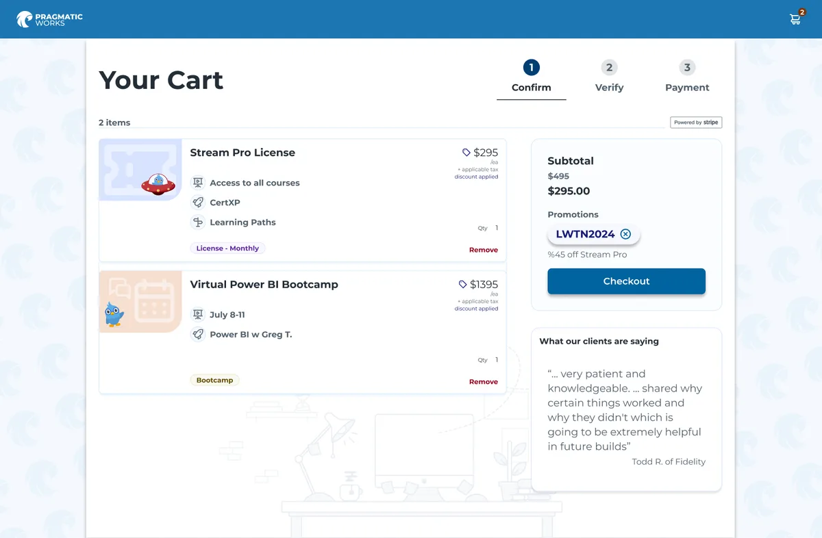
I redesigned the cart flow, pricing page, and course detail templates using reusable components — a deliberate choice to reduce the dev team's replication burden. Key changes included multi-item purchasing, coupon code support, Stripe branding, and testimonials in the cart to build purchase confidence.
Reflection
What I'd Do Differently
The email validation issue in the signup flow was identified early but deprioritized in favor of higher-impact cart fixes. In hindsight, it was a quick win that would have improved the initial funnel step significantly — and could have been shipped in the same sprint with minimal dev cost.
I'd also push earlier for design standards documentation to prevent regressions from rushed feature releases — several gains made in the cart flow were partially eroded within two quarters by scope-creep commits that bypassed design review.
The deeper lesson is about where influence actually lives. The inflection point in this project — where months of stakeholder skepticism collapsed into a prioritized initiative — came from watching real users struggle in a live session, not from a findings deck. I treated that as a lucky moment rather than a method to build on. In hindsight, institutionalizing that practice earlier — getting leadership watching real sessions regularly from the start, not as a one-off intervention — would have kept the shared empathy that drove the original investment alive long enough to prevent the regressions in the first place.
Outcome
2× Activation
2×
Activation rate
35%
Faster purchase flow
6 mo
Dev costs saved
Activation rates more than doubled — from 4.5% to over 10% — after resolving navigation bugs and shipping the redesigned purchase experience. Time-to-completion dropped by 35%. The PLG framework I presented to leadership became a reference point for product strategy going forward, shifting how the team evaluated feature prioritization.
Let's Connect
Like what you see?
Let's talk about what we could build together.