Case Study
Augmenting Value Proposition with CertXP — 62% Increase in Conversions
62%
increase in conversions
25%
output efficiency gain
1
new product category launched
Context
The business bet: whether a net-new product category could expand the platform's addressable audience and give sales a differentiated story in a crowded on-demand training market — without fragmenting the product or overloading a small engineering team.
At Pragmatic Works, I led the design of CertXP — a certification exam prep tool built as a complement to the platform's existing on-demand video training catalog. The goal was to augment the product's value proposition by offering a more immediately consumable format: a practice exam in the form of a game. After persuading leadership to address critical usability issues in the existing user journey, we scoped a focused beta and shipped on time. Post-launch, we discovered that some users preferred CertXP's format over video content entirely — opening a new conversation about user-appropriated learning paths.
Discovery
The MVP was shaped by a mix of requirements and constraints: leadership set the direction, engineering and PM bandwidth defined the scope, and a competitive audit of gamified learning platforms — Duolingo, Uxcel, and others — gave me the evidence to establish an impact/effort framework for what would make CertXP worth building.
Broader platform research — generalized user interviews, not CertXP-specific — had already surfaced a consistent pattern: many users were on the platform to pass a specific exam, not to become long-term learners. That exam-cram motivation shaped every format decision that followed.
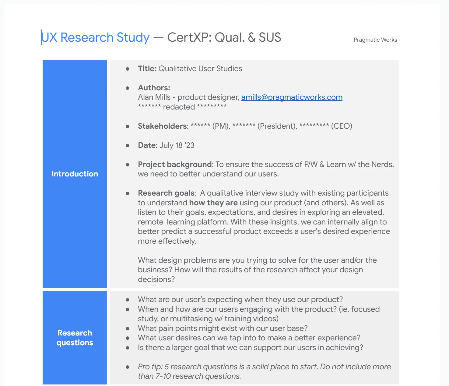
After the product was built, I ran usability studies including a formal SUS assessment — a scored instrument that let us compare iterations against a baseline rather than relying on subjective session impressions. Testing identified gaps in navigation and onboarding that were corrected before launch.
The Gamification Decision
The question wasn't whether to gamify — it was what kind of game fit the use case. Users studying for certification exams have a defined goal, a deadline, and high anxiety about failure. That context called for a format with clear progress signals, low-stakes repetition, and a sense of momentum — not the open-ended, chapter-by-chapter structure of video training.
Alternatives we considered: a structured quiz bank (low engagement, no sense of progress or forward motion), an adaptive learning path (too complex for the MVP scope and dev timeline), a certification progress tracker layered onto existing video content (didn't address the core friction of getting to value quickly enough). The game format won because it matched user intent precisely and gave us a natural onboarding arc — tutorial, practice, exam — that could be shipped incrementally and tested at each stage.
Design
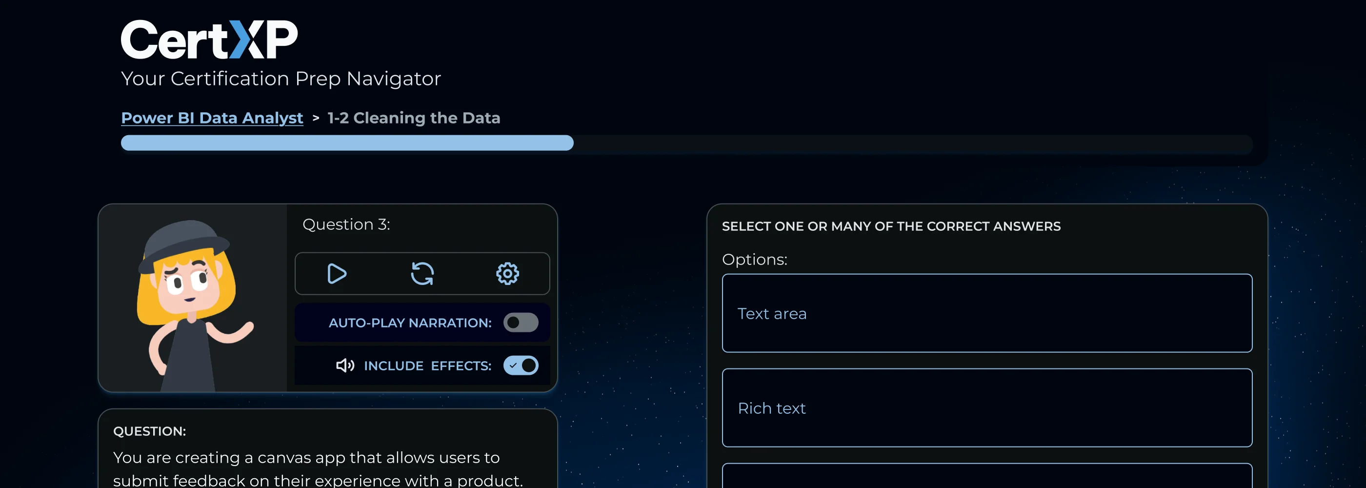
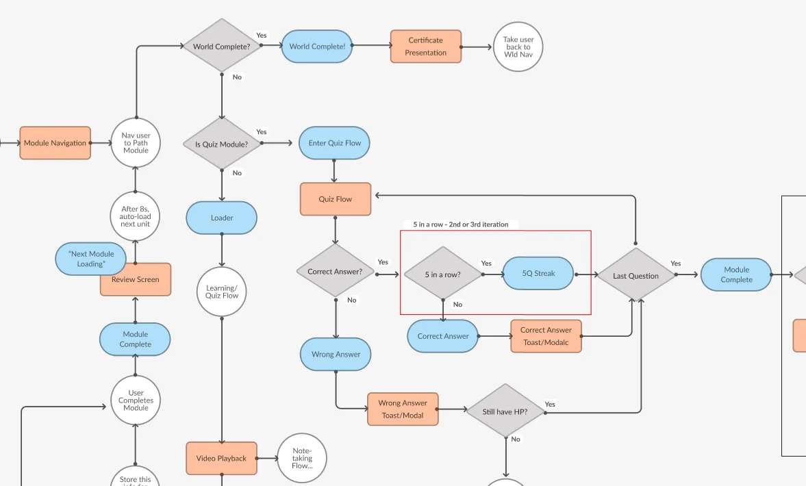
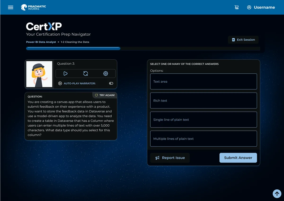
I iteratively crafted user flows, mockups, and interactive prototypes, balancing design ambition against the development team's capacity — this required intentional complexity reduction in the UI without sacrificing the game-feel. The game logic required a dedicated interaction flow — mapping quiz states, streak detection, wrong-answer recovery, and module completion — to keep the complexity contained in design before it hit dev. I delegated illustrations and Lottie animations to an offshore team, including a space-themed course map and a character-driven narrator that interacted with audio narration on the quiz screen. A phased Gantt chart helped me manage design, delegation, and research in parallel across multiple workstreams.
Impact
CertXP drove a 62% increase in conversions and an immediate influx of new subscribers at launch. But the more revealing finding came shortly after: many users came specifically to pass a certification exam, then cancelled — viewing the platform as no longer needed once they'd achieved their goal. This wasn't churn in the traditional sense. It was users completing a valid, shorter journey that the product hadn't been designed to support. That reframing changed how the team thought about subscriber lifespan, positioning, and what "success" looked like for this user segment. It also led directly to removing the requirement for sequential course completion — a constraint that had been optimising for retention metrics at the cost of user autonomy.
A further signal emerged post-launch: a subset of users were appropriating CertXP as an alternative to the platform's lengthier video content — choosing focused practice over passive consumption. That behavior, unplanned at launch, informed future product decisions about how CertXP engagement could drive broader platform adoption. The quiz screen below — the front-facing output of those complexity decisions — was the surface users interacted with to drive those results.
Reflection
Working within a feature-directive model meant the design work was less about validating a problem and more about making a directive worth shipping — using competitive audit findings and impact/effort criteria to shape scope rather than starting from user needs.
The biggest shift in thinking from this project was around user autonomy. We launched with assumptions about what a good subscriber journey looked like — complete courses, earn certs, stay subscribed. CertXP revealed that some users had a completely valid, shorter journey: prep, certify, done. Designing around that intent — rather than against it — was more honest than designing to prevent churn.
The 62% conversion increase is the headline, but the more durable lesson is that "power user" and "long-term subscriber" aren't the same thing. Some of our most successful users were never going to stay, and trying to hold them would have meant building the wrong product. That's a harder truth to present to stakeholders than a retention number, but it led to better product decisions.
Let's Connect
Like what you see?
Let's talk about what we could build together.